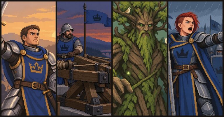
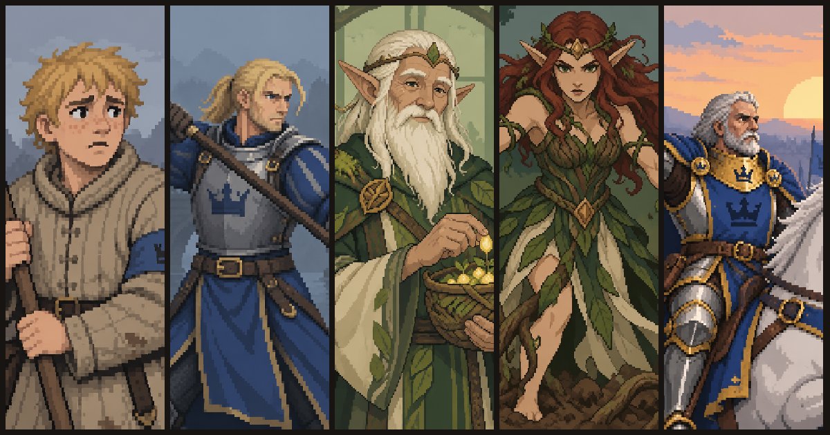
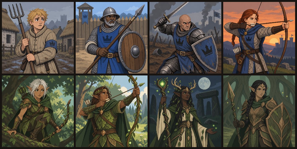
The current card art in Princess Siege has one clear strength: it is consistent. Human cards use the same blue uniforms, elven cards use the same greens, and the portraits share the same framing and level of detail.
It also looks obviously AI-generated, and I will probably change it.
Both of those things can be true. The current style has been useful for building and testing the game, but I do not consider it the finished art direction.
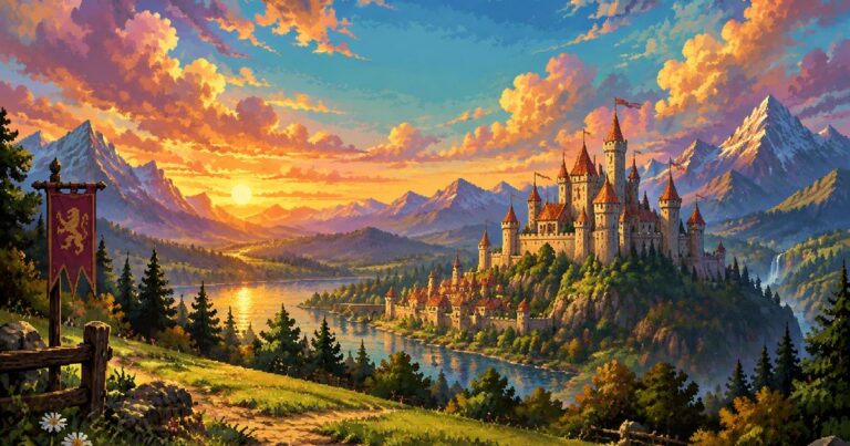
The first images were too detailed
The first shared prompt asked for lush, painterly pixel art with dramatic skies, rich colours and a lot of detail. The resulting images could look good when opened at their full resolution.
That was not where players would see them.
In the hand, a card only has a small window for its illustration. On the board, the same image is cropped again into a much smaller token. Details that looked impressive in the original image became noise once the card was reduced to the size used by the interface.
That made the real requirement clearer. I did not need each image to work as a large piece of standalone artwork. I needed the subject to remain recognisable when the image was small, cropped and surrounded by card information.
Testing one subject in several styles
Before generating the full card set, I used the same travelling blacksmith subject to test ten different prompt styles.
The variations included a detailed scene, a close-up of the blacksmith, a simple icon-like anvil, a deliberately chunky low-resolution version, a dark vignette, a two-colour version and several approaches to the background.
Using the same subject made the comparison easier. If every image had shown a different character, it would have been difficult to tell whether I preferred the style or simply preferred one subject.
The simpler, closer images worked better. That led to the current direction: one main figure or object, limited detail, a small palette and a background that does not compete for attention.
Why the portraits are close
The close-up portrait format is partly inspired by Gwent. Its card illustrations give characters enough space to be immediately recognisable, even when the card itself is not large.
For Princess Siege, the same source image needs to work in two places. It appears as a wider illustration when the card is in your hand and as a more square crop when that unit is on the board.
The shared style prompt therefore asks for a waist-up or three-quarter portrait, with the head and shoulders kept inside the top third. The subject fills most of the frame, but there is enough room around it for both crops.
That instruction is not really about artistic preference. It exists because earlier compositions lost faces or cut off important parts of the character when Godot cropped them.
Colour identifies the faction
The use of colour is deliberate.
Human soldiers wear blue cloth with steel armour and crown motifs. Elves use green clothing, leaves, bark and bronze. Future factions will have their own visual identities.
Gwent and Magic: The Gathering both use colour to help establish the identity of a card or archetype. I want the same immediate recognition here. You should be able to glance at a card and know which army it belongs to before reading its name or rules.
That matters when several cards are on the board at once. A consistent colour is quicker to read than a faction label on every unit.
The characters within each faction still need different ages, builds, skin tones, clothing and equipment. Consistency should make them look like members of the same army, not copies of the same person.
Consistent does not mean finished
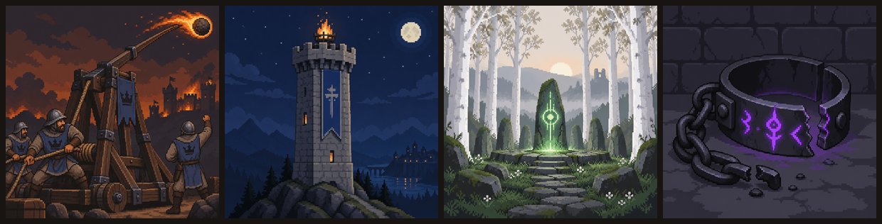
The shared prompt has worked surprisingly well. When I look across the current set, the images have the same pixel-art-like treatment, framing and palette. They look as though they belong to the same game.
That does not mean the style is the best choice for the finished game.
These are AI-generated illustrations made to resemble pixel art rather than pixel art drawn and adjusted by hand. That is visible, particularly when several images are shown together. Some details have the familiar generated look, and the overall style does not yet give Princess Siege much of its own identity.
For a prototype, I am comfortable with that. The images let me distinguish cards, judge the interface and play with a board that looks coherent. They have already done much more for the game than grey placeholder boxes would have.
Before release, I want to test several art directions again. I may keep the close portrait framing while changing everything else. I may move away from the current pixel treatment, change the palette or settle on a style that is less obviously generated.
Because the subject prompts and shared style instructions are separate, I do not need to start from nothing. The card descriptions can stay while I experiment with the instructions that control how they are rendered.
What I would do differently next time
The main thing I would keep is testing at the size used by the game.
A full-resolution image can hide problems that become obvious on a card. I would generate a small group, put them into the actual interface and compare them there before producing the rest of the set.
I would also test several styles using the same subject. It is a fairer comparison, and it is cheaper than discovering the problem after generating a hundred unrelated images.
The current art direction is not final, but it answered the question I needed answered at the time: can I produce a readable and consistent set of images while I work on the card game underneath them?
The answer was yes. The next question is whether I can find a style that is just as readable and consistent but feels more like Princess Siege.
If you have an art direction you think would suit the game, send it to hello@teamhayat.com. I am still interested in trying different approaches.